Responsive web design is good, but if you need to use HTML/CSS to format a document for print, the funky real-life units come in handy.
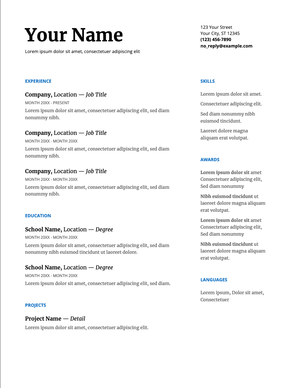
I used a Google Doc to create my resume for quite some time. It was the basic two-column template that shows up on the homepage.
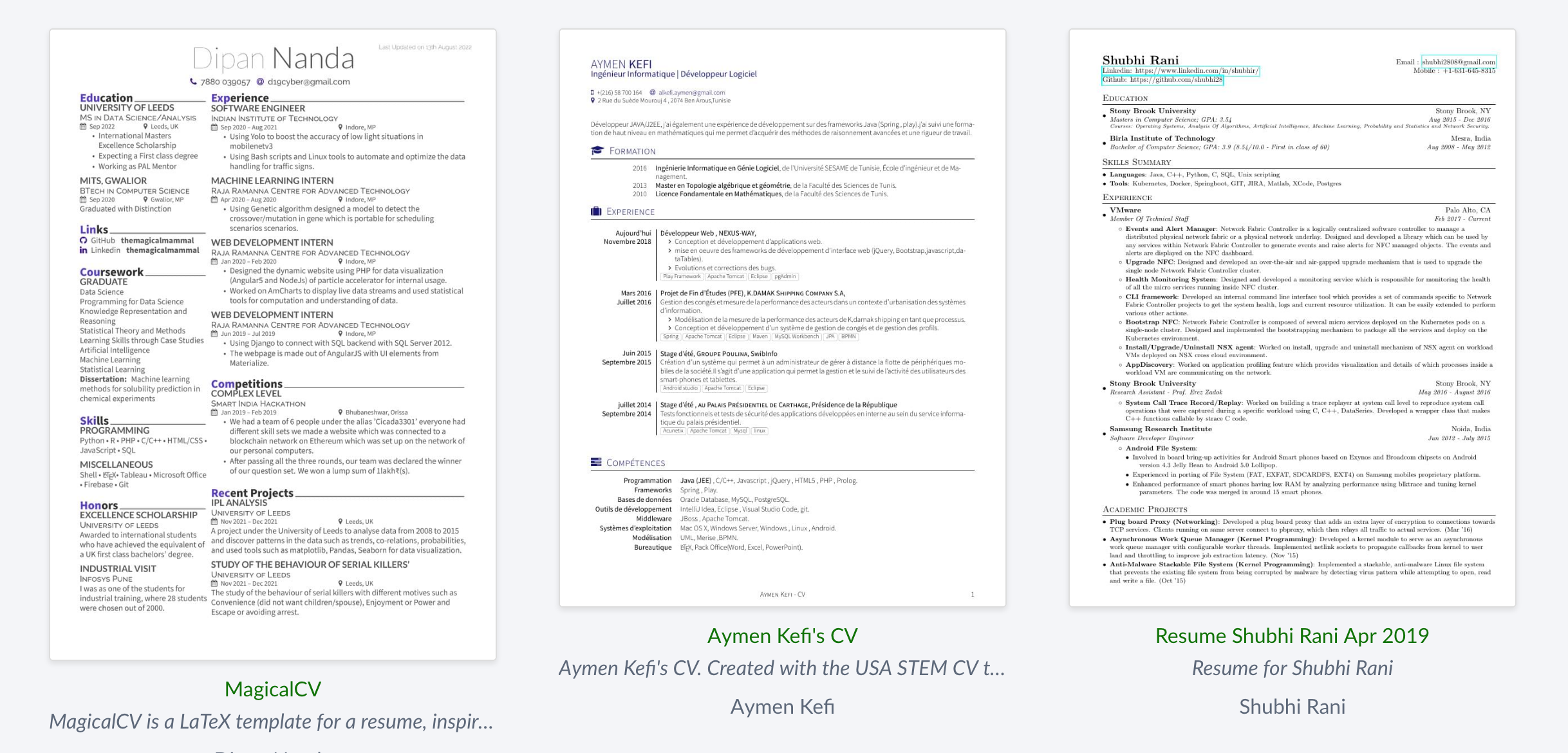
I also tried using LaTeX to format my resume. There’s a slew of templates online. You can imagine how that one went:
But there’s all sorts of specific units in CSS. There’s em, px, vw, vh, … There’s also pt, in, or cm. Imagine that: inches in web design! That would absolutely butcher the webpage between viewports. What about vertical monitors? I don’t even want to think about cell phones. Responsive design is the name of the game in the era of flexbox and SPAs. There is no place for <table>s for formatting or inches as a unit of measure. Not in the HTML/CSS era I grew up in.
You know what those units are great for? Text documents.
body {
  width: 8.5in;
  height: 11in;
  font-size: 12pt;
  margin: 0.5in;
}
Your webpage is now U.S. letter stock in 12pt font with a half-inch margin. But I’ll do you one better. We can limit the amount of content printed to the page with an @media query1:
@media print
{
  .noprint {
    display: none !important;
  }
}
This lets us control what actually shows up in the printed copy. I ended up using these techniques to make my current resume.
-
I saw this on StackOverflow originally, but I can’t find the source anymore. There’s plenty of spots, though. https://www.geeksforgeeks.org/how-to-hide-an-element-when-printing-a-web-page-using-css/ ↩